
I challenged myself to cut 270+ glyphs in one week.
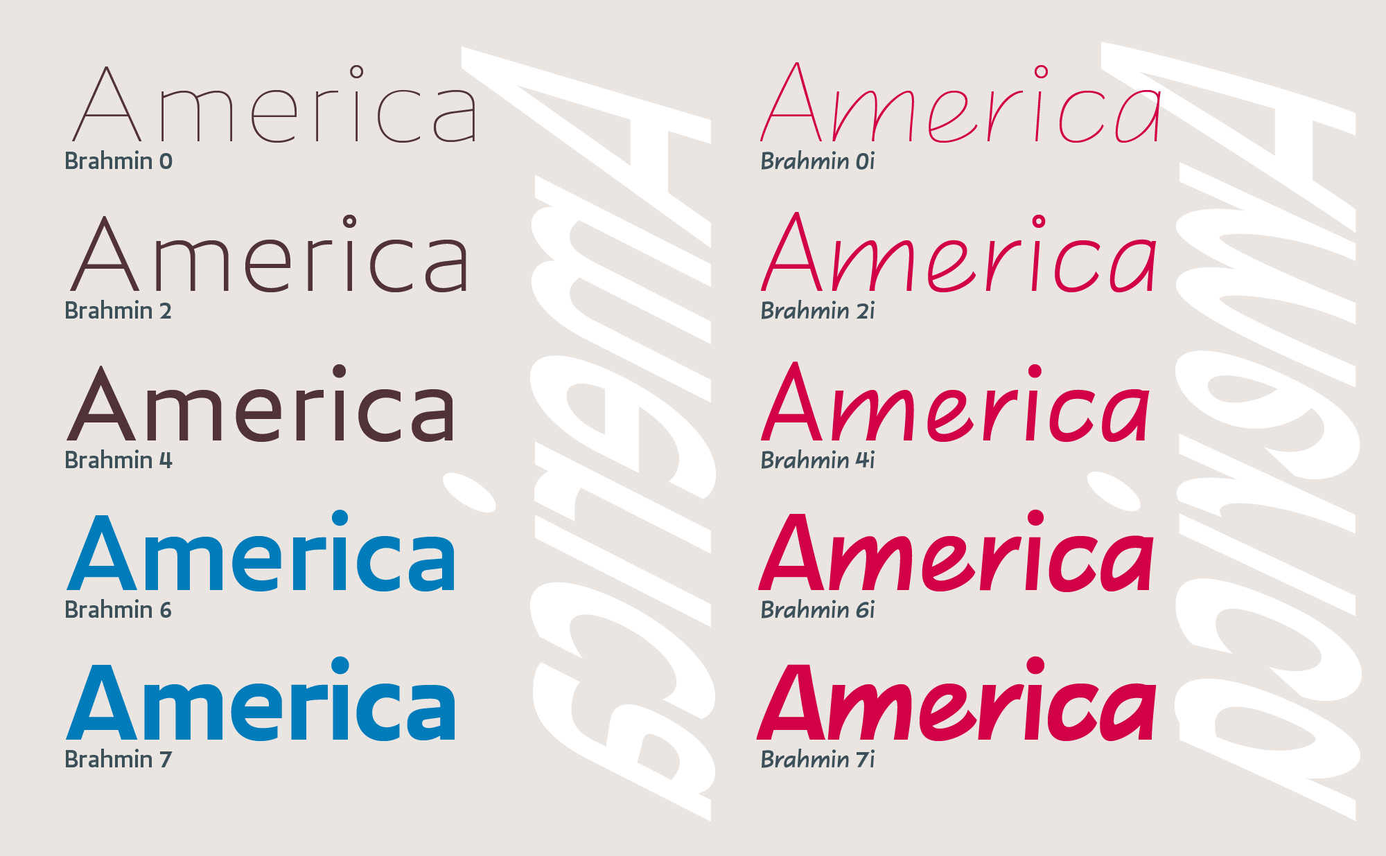
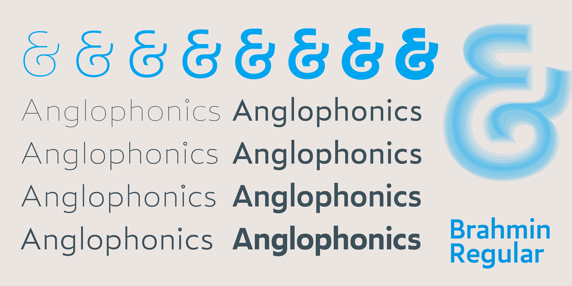
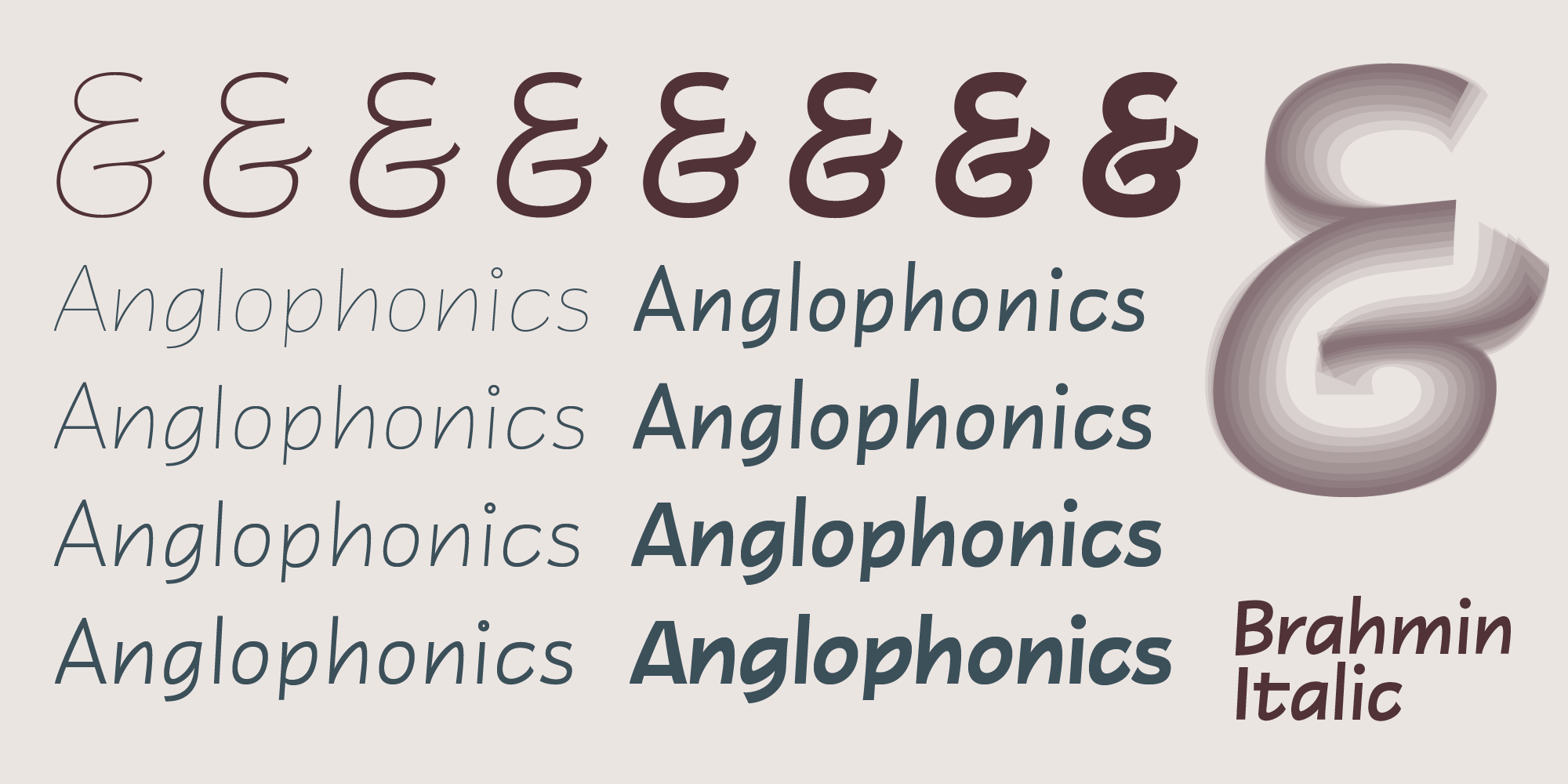
This is the new Brahmin family. I may give the italic a new ‘related identity’ in the Ergata system (such as the related identities of Canticle & Candor), or just treat it as an alternate mode of the Roman (the 4i, 5i, 6i… system I’m using now)
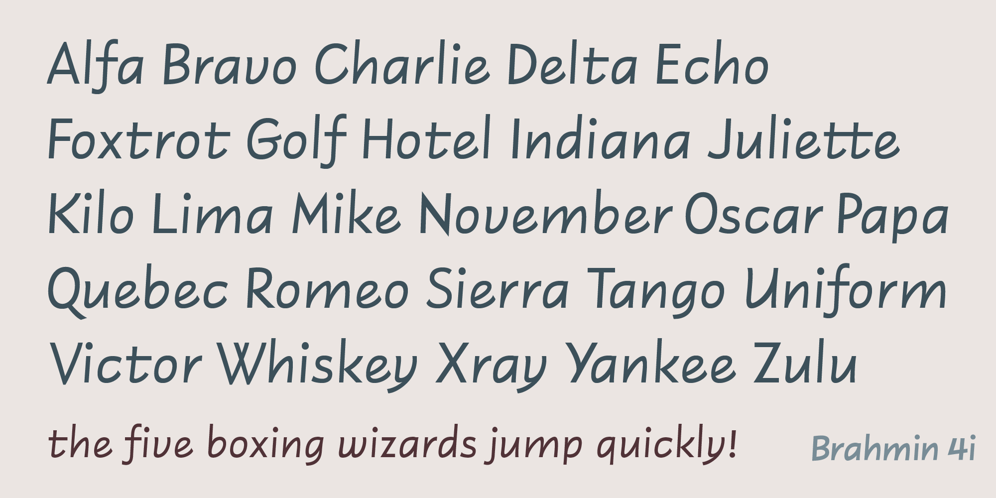
I cut the regular first. At TypeCon Xx, I saw Nina Stössinger’s excellent work on Conductor. She showed that the ‘italic’ look is all about triangularity: the upstroke, which cuts across rectangular letter interiors diagonally, creates a motif of slanted triangle wedges. Since Brahmin meaty around its skeleton, I subtly weighted the upstroke angle (~46°) as the italic’s central axis of contrast, evoking the modern comic hands: the marker, the pencil.

a d p b q g n h m u • Here I focused on the placement of the upstroke, its sharp curve where it begins from the left stem, its slow, relaxed transition into the right stem.

v w y • The v is a u without a right stem. The w and y are directly derived. Note the slight leftward flex of the upper stem. Helps with hinting while preserving the angle made with the upstroke.

c s r t f • strokes are cut off at the angles that allow them to be chunky, rather than sharp.
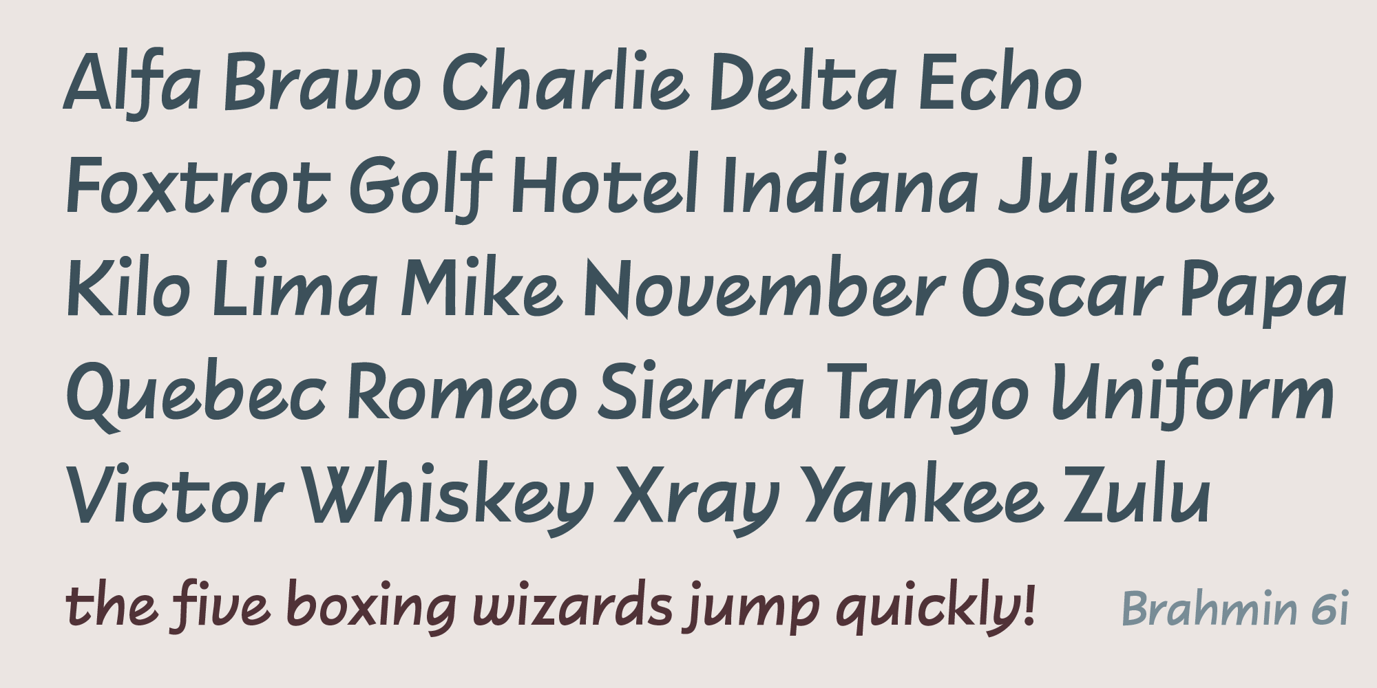
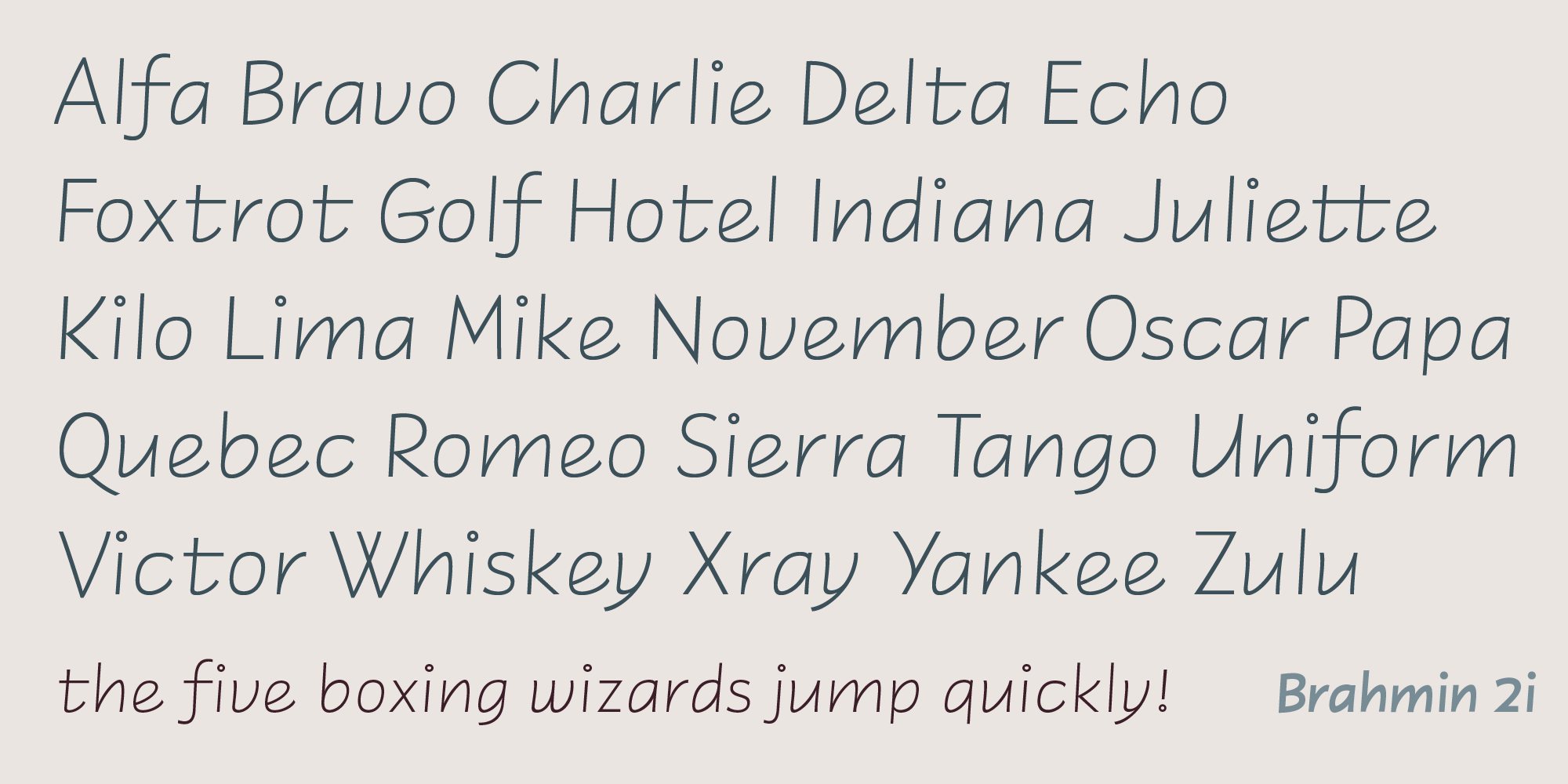
Next I cut the bold, then the light. (The above weights are adjacent interpolations of the dark and light masters, 7i and 0i.)
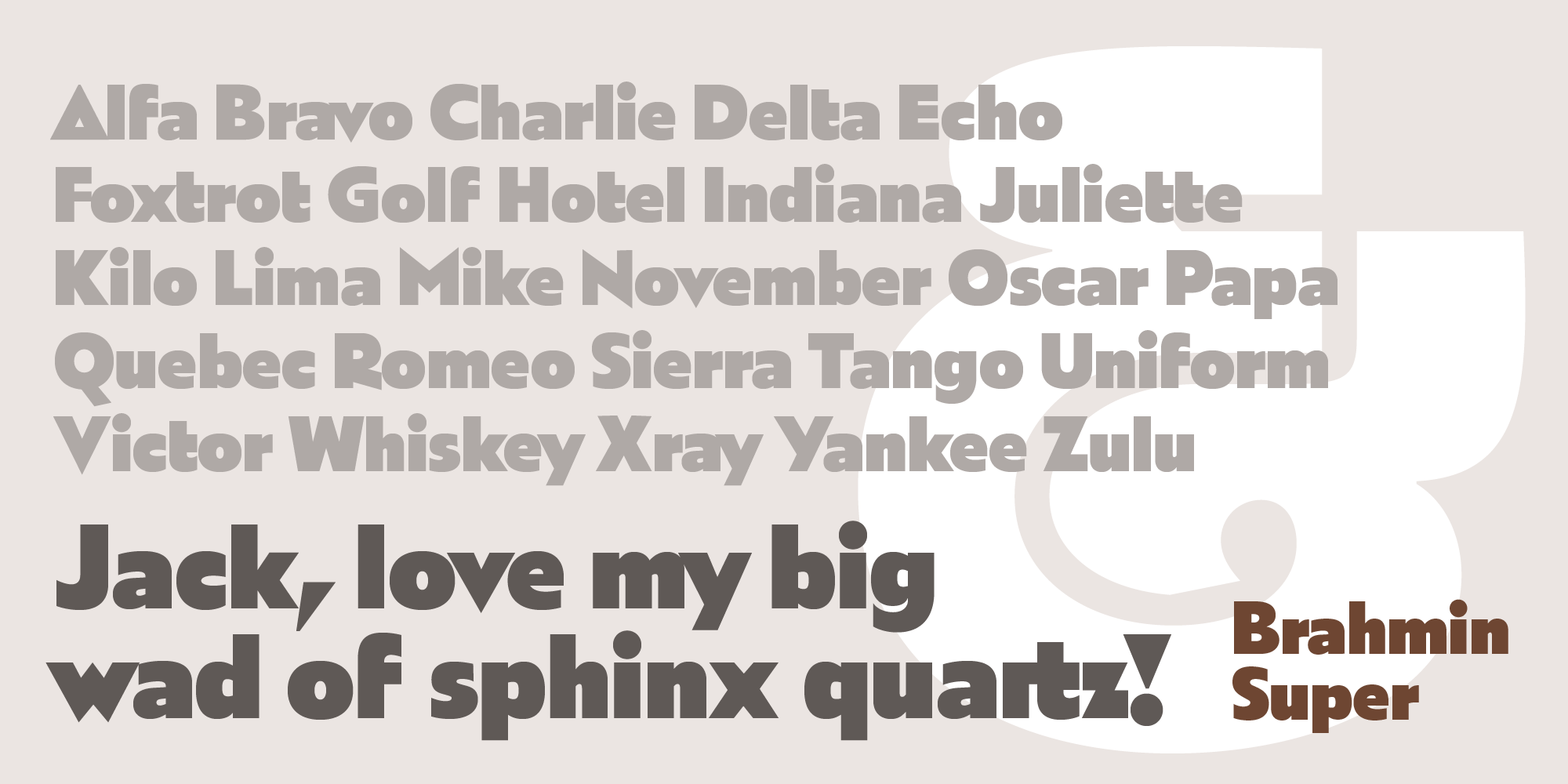
This brings the total number of fonts in the Brahmin set to seventeen. Italics still need some testing before release.
previous post